Join 9000+ designers, content designers and engineers who get my free weekly newsletter with evidence-based design tips (in 3 minutes or less). Mostly forms UX, but not always.
Adam Silver’s third law of form design
|
In 2008 I worked on a redesign of the checkout flow for Boots.com. We had the RNIB (Royal National Institute of Blind People) do an accessibility audit. The consultant found a lot of problems but the main one I remember was with form validation. She said:
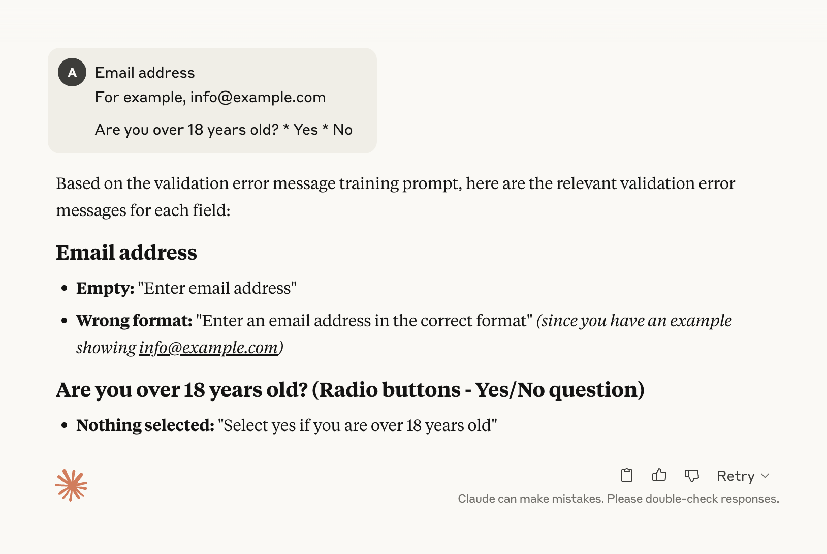
If you ever get a chance to work with the RNIB, do it because it’s eye opening. You learn to look and think about design differently. My experience working with the RNIB reminds me about my third law of form design which states: Users will make mistakes no matter how well your form is designed. It’s not that you shouldn’t do everything in your power to reduce errors. It’s that you need to realise that even if you the clearest questions and the most simple and accessible interactions possible users will still – at least sometimes – make mistakes. And when that happens, it’s a low point in their journey. This is why it’s so important to get users back on track as quickly and as easily as possible. Because if you don’t, they’ll get stuck or worse leave. If you want to give users the best validation UX, you must know the answers to three key questions: Question #1: When is the right time to validate? As the user types? As the user tabs to the next field? On submit? Is it a combination? Should you disable the submit button until all fields become valid? Does anything change in multi-step form flows? Question #2: What is the best way to present errors? Is it with HTML5 validation? Should error messages go at the top or bottom or both? How about next to the inputs? Should you use different patterns when the form only has one question? Question #3: How do you write crystal clear error messages? What makes a good error message? What makes a bad error message? Are error messages a good opportunity to show personality? I’ve used (and recommended) the same validation pattern since the RNIB schooled me back in 2008 – with some upgrades along the way. If you’d like to design forms that get users back on track from the lowest point in their journey, you might like my course Form Design Mastery. Module 3 has five lessons dedicated to just that: https://formdesignmastery.com See you soon, p.s. as I mentioned above, if you want users to recover from errors, one thing you need is clear error messages. Form Design Mastery has a dedicated video walkthrough for this. But if you pick it up today you’ll also get my AI error message generator:
You just type the labels and it generates all the error messages you need. What used to take minutes now takes seconds. |
Design tips to help you create products that are ridiculously simple and accessible to use
Join 9000+ designers, content designers and engineers who get my free weekly newsletter with evidence-based design tips (in 3 minutes or less). Mostly forms UX, but not always.
A year ago I posted this on LinkedIn: === I tell my students to avoid select boxes. Because it’s often better to use radio buttons. But students often say “But it’ll make the page too long”. Yep, but that doesn’t necessarily mean it’s bad UX. See the page I designed to let users select a course. Huge list of radio buttons. But no issues in user research whatsoever. Does this mean you should always use radio buttons? No. But most designers would balk at a design like this even though it worked...
Last week, I had a meeting with two devs and two designers. The meeting’s purpose was to let developers raise problems and get quick design decisions. One of the devs brought up an issue with a form that had conditional radio buttons. Here’s what the screen looked like (it’s a bit different to what I’m actually working on but close enough): When the user selects “Yes” it reveals a field to enter the name: If you leave it blank and submit the form, the page refreshes and shows an error: So far...
Quick one: Yesterday I sent you an email “My response to Hacker news comments”. I received a few responses asking for clarification in my second illustration – because I screwed it up. Here’s what it should have been: Enjoy,Adam